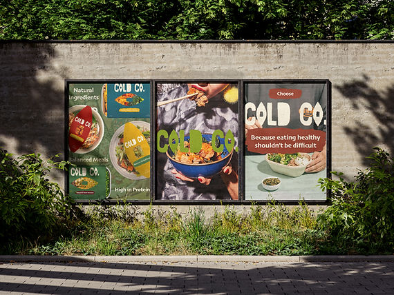
Cold Co. creates small-batch frozen meals made from locally sources ingredients for busy people who want to eat well without spending hours shopping and cooking.
My role for this project was to create a modern, trustworthy brand that feels approachable.

Using an all-caps, textured type, Cold Co. is seen as a modern, confident brand. The type is organic, resembling the organic ingredients of the prepped meals. The "O" being similar to an eye is a perfect use for an icon and packaging design.
The colour palette is filled with softer, natural tones that express nature and garden grown vegetables in the reds and greens.
It brings a down-to-earth vibe that isn't too loud and brings a fresh look.

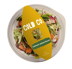
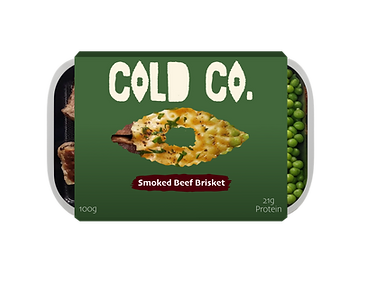
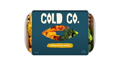
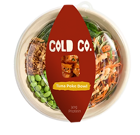
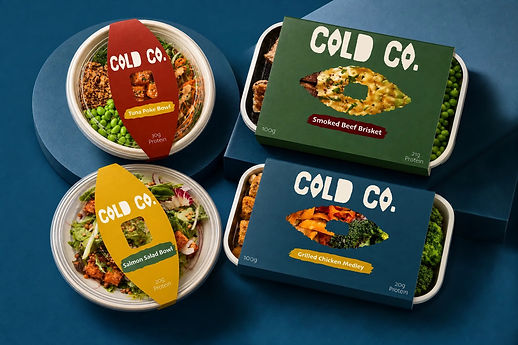
Mockups of the prepped meals displays the "O" from the logo, because it resembles an eye, it is designed as a "window" into the meal.
A solid colour for each kind of meal with a pop of colour that makes the meal name stand out.
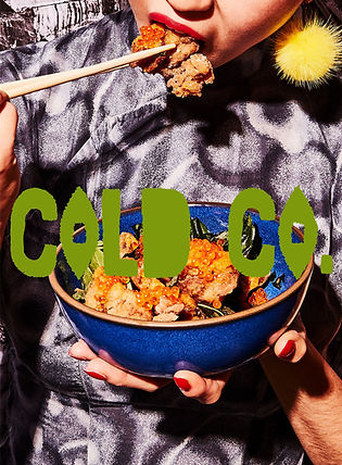
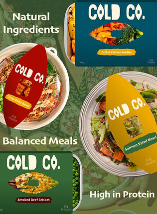
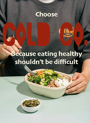
Posters that advertise Cold Co. and what they stand for as a company that can be used on social media and billboards.